Every web designer and developer knows the frustration of manually writing CSS for gradients, shadows, and color conversions. What should take seconds often consumes valuable minutes as you tweak values, check browser compatibility, and hunt for the perfect color codes.
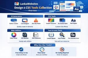
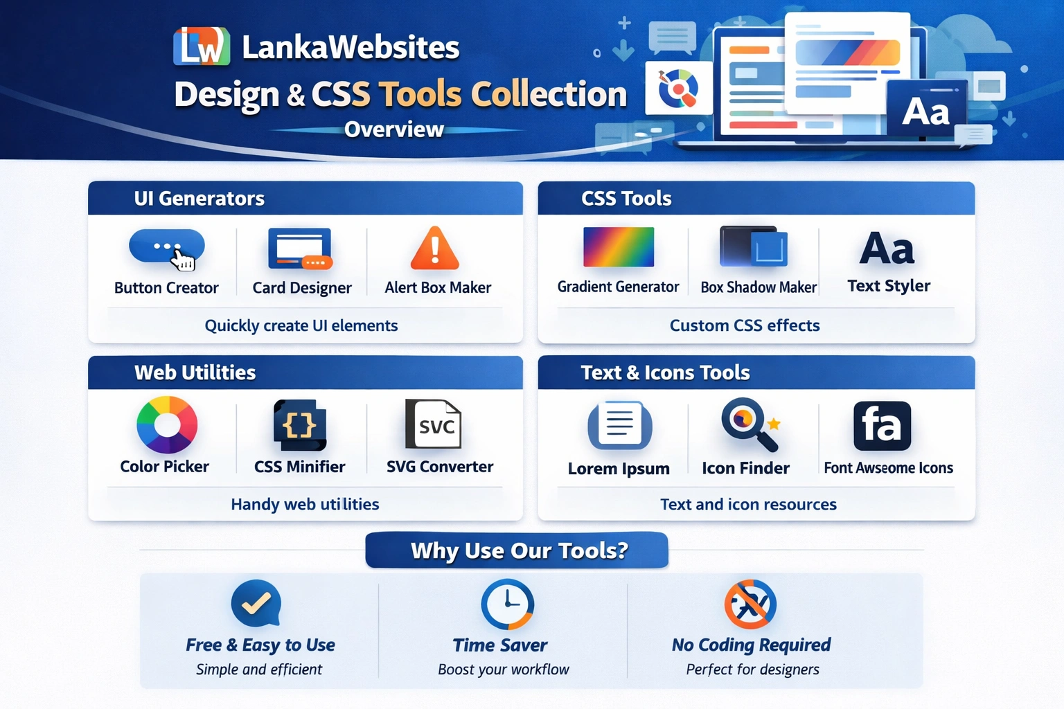
LankaWebsites offers a comprehensive collection of 12 free design and CSS tools that streamline your workflow. From visual gradient builders to color palette generators, these tools provide instant, ready-to-use CSS code that works across all modern browsers.
Let’s explore each tool and discover how they can transform your design process.
Color Tools – Master Your Color Workflow
Color is fundamental to every design project. These four tools cover everything from picking individual colors to generating complete harmonious palettes.
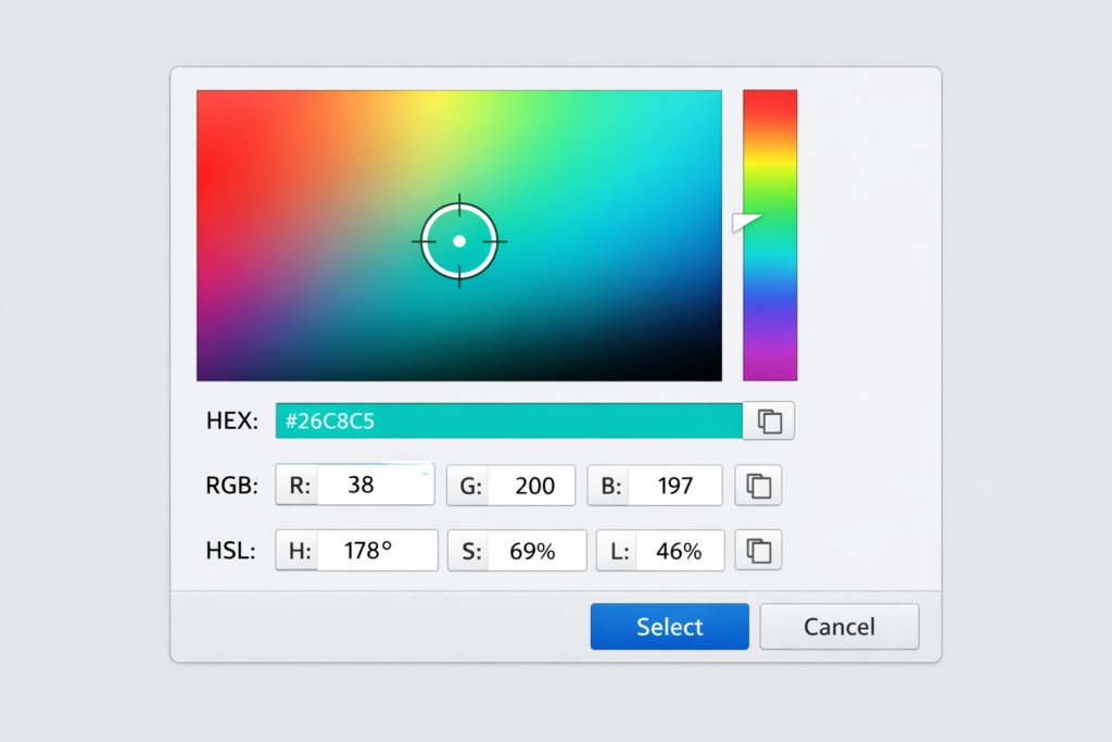
1. Color Picker – Visual Color Selection Made Easy
The Color Picker provides an intuitive visual interface for selecting colors. Rather than guessing at color codes, you can click directly on a color spectrum to find exactly the shade you need.
Once you select a color, the tool instantly provides the color code in multiple formats including HEX, RGB, and HSL. This eliminates the need to manually convert between formats when different parts of your project require different notations. The tool also includes palette saving functionality, allowing you to build collections of colors for ongoing projects.
2. Color Converter – Translate Between Color Formats
The Color Converter handles the tedious task of converting color values between different formats. Input a color in any format and instantly see its equivalent in HEX, RGB, HSL, HSV, and CMYK.
This tool proves invaluable when working across different design applications. Photoshop might give you a color in HSB, your CSS needs HEX, and your print designer wants CMYK values. Instead of hunting through conversion tables or doing manual calculations, simply paste your color code and get all formats simultaneously.
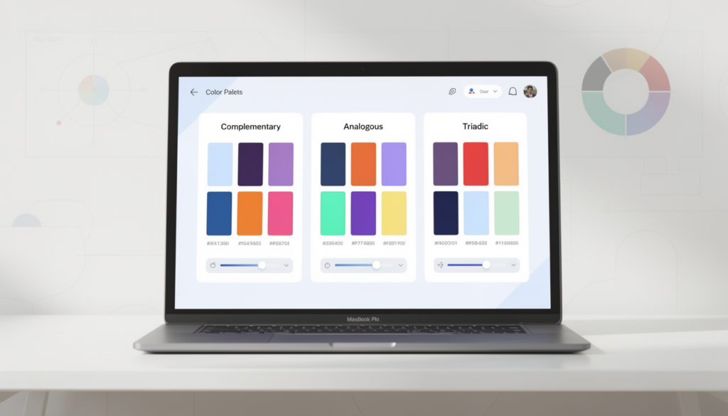
3. Color Palette Generator – Create Harmonious Color Schemes
The Color Palette Generator transforms a single base color into a complete harmonious palette using color theory principles.
Select your starting color and choose from multiple harmony types including complementary colors that sit opposite each other on the color wheel, analogous colors that sit adjacent for subtle variations, triadic schemes using three evenly spaced colors, split-complementary for high contrast with less tension, tetradic or square schemes using four colors, and monochromatic palettes with variations of a single hue.
Each generated palette provides colors in multiple formats ready for export. This tool is particularly valuable for branding projects, website color schemes, and any design work requiring cohesive color relationships.
CSS Visual Generators – See What You Build
These tools provide visual interfaces for creating CSS effects, showing live previews as you adjust values and generating clean, copy-ready code.
4. Gradient Generator – Beautiful CSS Gradients in Seconds
The Gradient Generator is one of the most powerful tools in this collection. Creating CSS gradients manually requires remembering syntax, calculating color stop positions, and testing across browsers. This tool handles all of that visually.
Choose between linear gradients that flow in a straight line or radial gradients that emanate from a central point. Add as many color stops as your design requires, each with precise position control. For linear gradients, adjust the angle to control the direction of color flow.
The live preview updates instantly as you make changes, showing exactly how your gradient will appear. When satisfied, copy the generated CSS code which includes browser prefixes for maximum compatibility. The code works immediately in your stylesheets without modification.
5. Box Shadow Generator – Add Depth to Your Elements
The Box Shadow Generator provides visual control over one of CSS’s most expressive properties. Box shadows can make elements appear to float above the page, create subtle depth, or add dramatic effects.
Adjust the horizontal and vertical offset to position where the shadow falls. Control the blur radius to create sharp or soft shadows. Use the spread value to expand or contract the shadow size. Pick any color and transparency level for the shadow itself. The live preview shows your element with the shadow applied in real-time.
The tool generates clean CSS that works across all modern browsers, taking the guesswork out of shadow creation.

6. Border Radius Generator – Perfect Rounded Corners
The Border Radius Generator gives you precise control over rounded corners. While many designs use uniform radius values, this tool enables individual corner control for more creative shapes.
Set different radius values for each corner to create asymmetric designs. The visual preview shows exactly how your element will look with the applied border radius. Whether you need subtle rounding for buttons or dramatic curves for decorative elements, this tool provides the precision you need.
The generated CSS includes the standard border-radius property that works universally in modern browsers.
Unit Converters – Bridge Different Measurement Systems
Modern responsive design often requires working with multiple unit systems. These converters eliminate manual calculations and potential errors.
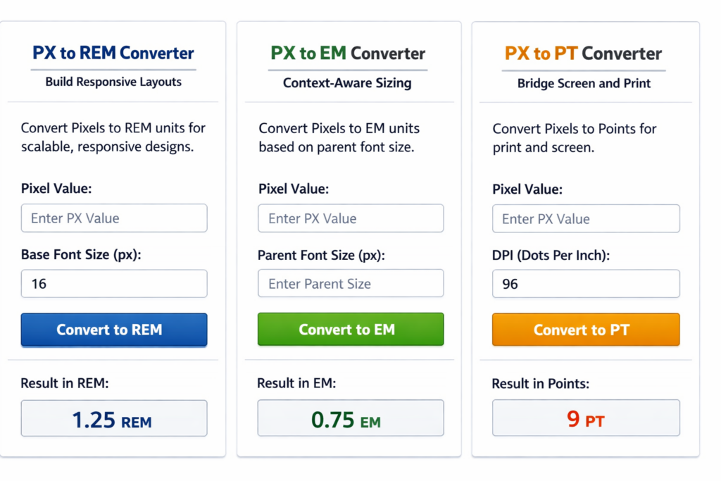
7. PX to REM Converter – Build Responsive Layouts
The PX to REM Converter is essential for responsive web design. REM units scale based on the root font size, making your layouts adapt gracefully to different screen sizes and user preferences.
Enter your pixel value and specify the base font size, typically 16px for most browsers. The tool instantly calculates the equivalent REM value. This conversion is crucial when translating fixed pixel designs into flexible, accessible layouts.
Using REM units instead of pixels respects user browser settings for text size, improving accessibility for visitors who need larger text.
8. PX to EM Converter – Context-Aware Sizing
The PX to EM Converter handles conversions for the EM unit, which scales relative to the parent element’s font size rather than the root.
Set the parent font size to get accurate EM calculations. This tool is particularly useful when working within components where font sizes cascade. Understanding the relationship between parent size and EM values helps create properly proportioned nested elements.
9. PX to PT Converter – Bridge Screen and Print
The PX to PT Converter handles the often-confusing translation between screen pixels and print points. When designing for both web and print, or when specifications arrive in points but implementation requires pixels, this tool ensures accuracy.
The conversion accounts for DPI settings, which affect how pixels translate to physical measurements. Specify your working DPI for precise conversions that maintain intended sizes across mediums.
Dimension and Ratio Tools – Maintain Visual Consistency
These tools help maintain proper proportions and calculate dimensions for images, videos, and responsive containers.
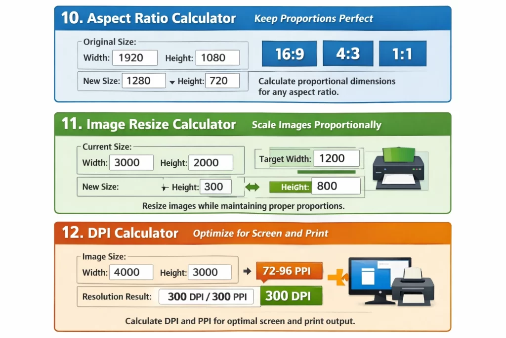
10. Aspect Ratio Calculator – Keep Proportions Perfect
The Aspect Ratio Calculator solves a common design challenge: resizing content while maintaining its original proportions.
Enter original dimensions and one target dimension, and the tool calculates what the other dimension must be to preserve the aspect ratio. This is invaluable when resizing images, creating responsive video containers, or ensuring design elements scale correctly.
The calculator also identifies common aspect ratios like 16:9 for widescreen video, 4:3 for traditional formats, and 1:1 for square content. Understanding these ratios helps when designing for specific platforms or media requirements.

11. Image Resize Calculator – Scale Images Proportionally
The Image Resize Calculator focuses specifically on image dimension calculations. Enter your current image size and specify either a target width or height, and the tool calculates the proportional counterpart.
This eliminates the risk of distorted images from incorrect manual calculations. Whether preparing images for specific containers, creating thumbnail sizes, or ensuring consistent image dimensions across a project, this tool provides quick, accurate results.
12. DPI Calculator – Optimize for Screen and Print
The DPI Calculator determines dots per inch (DPI) or pixels per inch (PPI) from dimensions and resolution. This information is critical when preparing assets for different output mediums.
Screen displays typically use 72-96 PPI, while print requires 300 DPI or higher for quality output. This tool helps you understand whether your images have sufficient resolution for their intended use and what dimensions you need to achieve specific DPI targets.

Why Choose LankaWebsites Design Tools?
Several factors make this collection stand out for designers and developers.
Ready-to-Use CSS Output
Every generator produces clean, standard CSS code that works immediately in your projects. The code follows best practices and includes necessary browser prefixes where applicable. Simply copy and paste into your stylesheet.
Live Visual Previews
See exactly what you’re creating as you adjust values. The real-time preview eliminates the trial-and-error cycle of making changes, saving, refreshing, and checking results. This visual feedback dramatically speeds up the design process.
No Cost, No Registration
All twelve tools are completely free with no usage limits. You don’t need to create an account, provide an email address, or deal with premium upsells. The tools are simply available whenever you need them.
Works Everywhere
The tools function on any device with a modern web browser. Whether you’re at your desktop workstation, working from a laptop, or making quick adjustments on a tablet, the responsive interface adapts to your screen.
Modern Browser Compatibility
Generated CSS follows current standards and works across Chrome, Firefox, Safari, Edge, and other modern browsers. For properties that benefit from vendor prefixes, the tools include them automatically.
Common Design Workflows Using These Tools
Here are some practical scenarios where these tools shine.
Creating a Brand Color System
Start with your primary brand color in the Color Palette Generator. Generate complementary and analogous variations to build a complete color system. Use the Color Converter to get each color in HEX for web, RGB for digital applications, and CMYK for print materials.
Building a Button Component
Design a button by first selecting your base color with the Color Picker. Create a gradient background using the Gradient Generator for visual interest. Add depth with a subtle shadow from the Box Shadow Generator. Round the corners appropriately with the Border Radius Generator. Export all the CSS and combine it into your button stylesheet.
Preparing Responsive Images
Calculate required dimensions for different breakpoints using the Aspect Ratio Calculator. Verify DPI is appropriate for retina displays with the DPI Calculator. Use the Image Resize Calculator to determine exact pixel dimensions for each responsive size.
Converting Legacy Designs
When modernizing older CSS that uses fixed pixel values, run key measurements through the PX to REM Converter for responsive typography and spacing. This systematic conversion creates flexible layouts that respect user preferences.
Tips for Getting the Most from These Tools
Bookmark the main Design & CSS Tools page for quick access to all tools from a single location. Consider opening multiple tools in separate tabs when working on complex designs that require gradients, shadows, and color adjustments simultaneously.
When working on team projects, share generated CSS snippets rather than just color codes. This ensures everyone uses identical values and prevents subtle inconsistencies from manual re-creation.
For color-intensive projects, start with the Color Palette Generator to establish your scheme, then use individual tools for specific implementations. This top-down approach creates more cohesive designs.
Frequently Asked Questions
Can I use the generated CSS in commercial projects?
Absolutely. All CSS code generated by these tools is free to use in any personal or commercial project without attribution required.
Do the tools work offline?
The tools require an internet connection as they run in your browser from the LankaWebsites server. However, once you copy the generated CSS, you can use it anywhere.
Are browser prefixes included?
Yes, for CSS properties that benefit from vendor prefixes for broader compatibility, the generators include appropriate prefixes automatically.
What browsers support the generated CSS?
The generated code works in all modern browsers including the current versions of Chrome, Firefox, Safari, and Edge. For older browser support, you may need additional fallbacks.
Conclusion
Quality design tools shouldn’t require expensive subscriptions or complex software installations. The LankaWebsites Design & CSS Tools collection provides professional-grade functionality through simple, focused browser-based tools.
Whether you’re generating gradients for a hero section, building a color palette for a new brand, converting units for responsive layouts, or calculating image dimensions, these twelve tools cover the essential design tasks that developers and designers face daily.
Visit the Design & CSS Tools page today and streamline your design workflow with instant, visual CSS generation.